Design system · 2026


Votee Design System
A governed component library — tokens, primitives and a 466-mark asset set — that keeps six products speaking one language.
Design systemsUIFront-end
- 41
- UI primitives on one token contract
- 466
- Marks in the asset library
- 51
- Story files documenting component states
- 16
- Segments the third-party set is curated into
01Project overview
- Role
- Design system owner — tokens, components, governance
- Timeline
- 2026 — current
- Surface
- Web Portal · Agent
- Consumers
- Votee tech team
I own the system end to end — token spec, component library, asset set, and the cadence that keeps them in step.
Where it ships
Self-hosting design system.
A lighter second output — design.md
One portable file — colour roles, type scale, spacing, etc.
02Target user
Two audiences, opposite asks. Neither is a designer.
Votee tech teammates
Engineering
They use Claude Code to build PoCs, documentation sites, and production UI.
Already working in
- Claude Code
- MCP
- Votee Agent Skills
Votee biz teammates
Commercial
They need quick access to the right assets for decks and docs. As the buffer time to prepare sales material are tight.
Already working in
- Google Slides
- Manus
- Google Docs
 Claude Code
 MCP
MCP Google Slides
 Manus
Manus Google Docs
03Situation
Votee AI Studio is vibe-coded — no one draws it. Inside one app, the same button ships at five sizes with six different animation timings.
One product · one button component
Nobody drew it. Nothing agrees.
8 declared sizes · 5 in use · 331 instances
sm absorbs half the traffic and default is never typed once · icon and icon-lg are byte-identical · 10 more decide their size at runtime
6 transition durations · 10× spread
duration-200 ×23 — closest to a default, never declared as one
After
3 semantic sizes · 1 motion token
One token contract · every surface picks up the update automatically
04Systematic taxonomy
Shipped app layer
--radius 0.65remglobals.css
shadcn “Orange” theme — OKLCH, a functional ramp, --chart-1…5.
Google Sans Flex / Code
- In-product UI
01
Primitive value
#ff7f32
oklch(0.7 0.19 48)
02
Semantic role
primary
Named for what it means, not what it looks like.
03
Component token
- Button.bg
- primary
- Button.fg
- on-primary
04
Platform output
- Web — React / Tailwind
- Flutter — Material 3
- React Native
Governing rule
In-product code reaches for bg-primary and text-muted-foreground — never a raw hex value.
One rule does most of the work
Product code asks for the primary action colour. It never asks for orange.
Anatomy of a token name
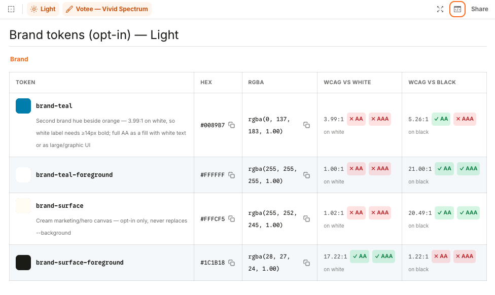
Shipped brand token — opt-in layer
- brand- — namespace: the opt-in brand layer — it never replaces --background
- teal — role: the second brand hue, used beside orange
- foreground — pairing: the ink guaranteed to pass contrast on that surface
Produces
tier="enterprise"DS classes: border-brand-teal/30 bg-brand-teal/10 text-foreground
Tailwind + shadcn/ui — shipped app layer
- sidebar- — scope: which surface owns it — scoped tokens re-theme independently
- accent — role: the semantic slot — accent, primary, muted, destructive
- foreground — pairing: the ink for that slot, not a separate colour decision
Produces
bg-sidebar-accent text-sidebar-accent-foregroundWhy the pairing is named, not chosen
Each token ships with its contrast ratio measured against white and black and graded AA/AAA. A surface and its -foreground are published as a pair, so a passing combination is the one already in reach.
Same anatomy, shadcn/Tailwind grammar
--muted-foreground
role + relationship
Primary label
Supporting / secondary
--chart-1
family + index
--accent-soft-border
role + modifier + element
Callout
Border slot — not fill or text.
05Managed versioning
Two surfaces, kept in step by a short loop.
The MCP server and the component library have to describe the same thing. When MCP falls behind, agents confidently build against a shape that no longer exists.
Two surfaces, one shape
MCP server
What agents query
Components, tokens, logos.
Component library
What ships
The React primitives, live in Storybook.
The sync loop
- 1
Component changes
A primitive or pattern is updated.
- 2
Announced in channel
Posted where the whole team sees it.
- 3
Reviewed at weekly
Team agrees what MCP should expose.
- 4
MCP updated
Server catches up to the new shape.
- 5
Agents build right
Generated screens match what actually ships.
The mechanism
Weekly sync
Walks through what changed and what MCP should expose.
Team channel
Where a change lands the moment it ships, in the open.
How it stays in step
Changes are announced in the team channel as they land, then reconciled at the weekly. Short loop, no surprises.
06The mark library
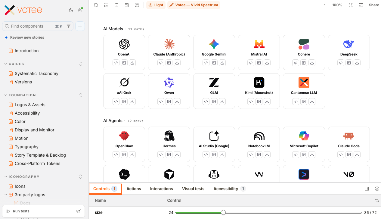
Icons are another useful component for business teammates.
The full third-party set is curated into 16 segments across the design system. This section shows 5 of them — 86 marks in total.
- AI Models· 11 marks
- AI Agents· 19 marks
- AI Protocol and Framework· 3 marks
- Data & Infrastructure· 24 marks
- Task-Oriented Platform· 29 marks
07AG-UI
As the agent works, the screen updates live — not all at once when it's done.
AG-UI is the connection between the agent and the screen. It sends each small change as it happens, so the reply builds in front of you.
AG-UI
What’s runningThe Agent ↔ User streaming protocol — typed SSE events that carry what the agent is doing straight to the screen as it happens. It is the system’s primary transport.
- Packages
- @ag-ui/core · @ag-ui/client
- Stream endpoint
- POST /v1/threads/{id}/agui-stream
- State model
- The backend keeps a canonical CognitiveState and ships minimal RFC-6902 JSON Patches as STATE_DELTA events — the client mirrors server state with no per-event reducers.
This is the one the whole system actually runs on.
[genui:comparison-table]JSON spec (what the agent emits)
{
  "root": "card",
  "elements": {
    "card": {
      "type": "Card",
      "props": { "title": "Model comparison", "maxWidth": "full" },
      "children": ["table"]
    },
    "table": {
      "type": "Table",
      "props": {
        "columns": ["Model", "Context", "Cantonese acc.", "Latency"],
        "rows": [
          ["Atlas",     "1M",   "+12%", "120ms"],
          ["Beever-LR", "256k",  "+8%",  "90ms"],
          ["Baseline",  "128k",   "—",  "140ms"]
        ],
        "caption": "Q2 evaluation set"
      }
    }
  }
}
Rendered result
Model comparison
| Model | Context | Cantonese acc. | Latency |
|---|---|---|---|
| Atlas | 1M | +12% | 120ms |
| Beever-LR | 256k | +8% | 90ms |
| Baseline | 128k | — | 140ms |
Server
Keeps the one true record
Every message, tool call and step the agent takes updates a single record on the server — the one source of truth.
Streaming
Sends only what changed
Instead of resending everything, the server streams just the small update, each time something happens.
App
Applies each update live
The app merges every update into its own copy automatically, with no extra code per case.
Screen
Simply draws what it's given
That live copy is what you see — message bubbles, tool activity, reasoning steps.
08Impact & results
Icon library
466 marks total
- In-house, soft-3D
- 304 marks · 6 products
- Third-party brand
- 162 marks · 16 segments
- UI primitives
- 41
- Storybook stories
- 51
51 stories against 41 primitives — every component ships with more than one documented state.
Platform reach
2 token layers → 3 targets
- Brand spec
- Shipped app tokens
- Web — React / Tailwind
- Flutter — Material 3
- React Native
466 marks, 41 primitives documented across 51 stories, one token spec reaching three platforms — the same system, drawn once.
- Component states are documented rather than remembered.
- Marks come from the library, not from a per-deck hunt.
- Agent-generated front ends land inside the system by default.
- What I'd change: adoption is visible only by reading code. It should report itself.
09AI-native execution
Authored as source, not as a file to copy — tokens, stories and the mark pipeline live in the repo.
Claude Code — Where the token spec, components and stories are written — and the MCP server that exposes them.
Storybook — The published contract: one story per state, a docs page per component.
Playwright — Interaction tests behind the stories, plus a render check on every mark.
Figma — Where type scale, spacing and mark candidates are judged by eye first.
Mermaid — Architecture and taxonomy diagrams themed through one shared variables block.


Teammate involved
Agents did the typing. I wore both hats here — set the direction, made the calls, reviewed what shipped.
 UX/UI DesignerAI Engineer