Challenge
Usability
Language differences
Line-height, text orientation, and text length from South East Asia and Middle East might be different from English or Chinese.
Multi-platform
TV, Mobile App, and website are using different sets of Front-end files and libraries. It takes effort to align them all
Execution
Translation Gap
Static Figma layouts and components might not be enought to cater all development scenarios
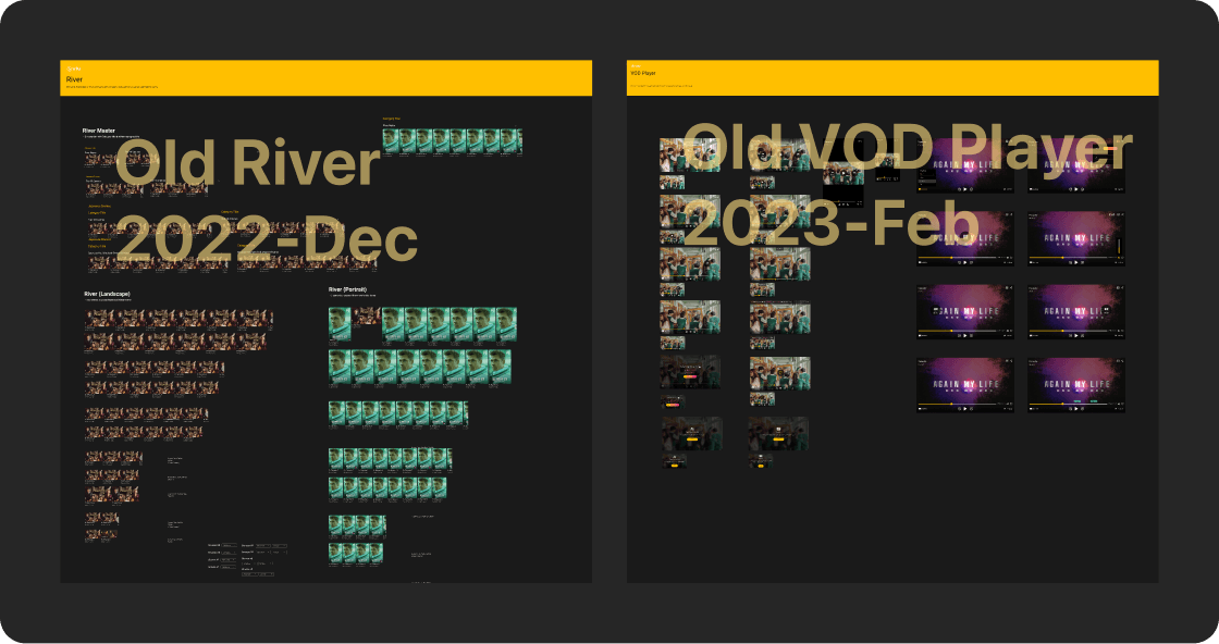
Old version/ 3rd party embeded UI
Need to remark those UI which is not applying our design system foundations
Team Operational
Info alignment Issue
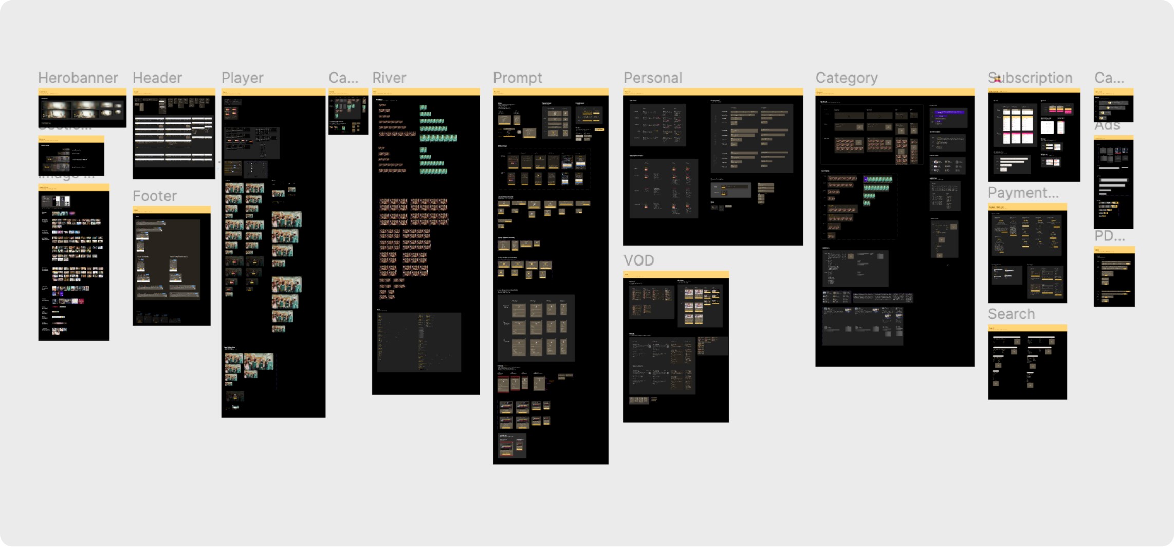
We don't know which components are approved and updated or not
Atomic Design System
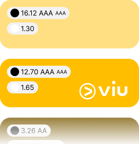
WCAG Guideline
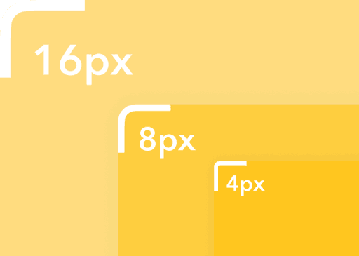
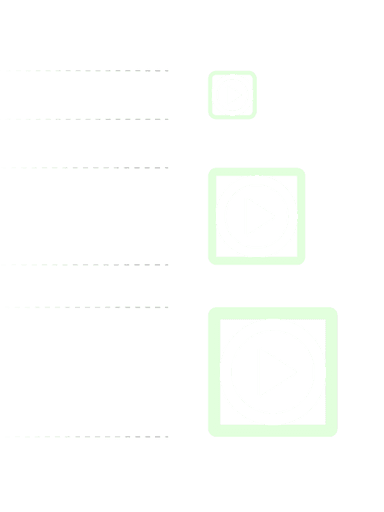
Radius
Typeface

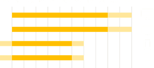
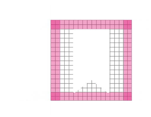
Spacing Standard
Type Scale
Button
Icon Frame
Icon Scale
iOS Android
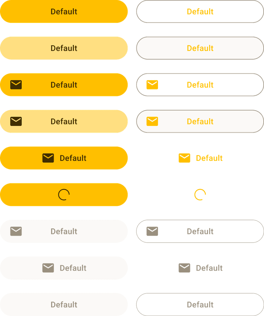
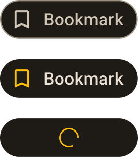
Button State
Cards
Banners
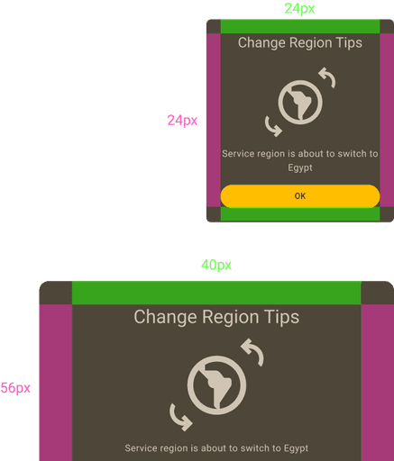
Padding Standard
Thumbnails
Layers
Composition
Pages
🌎
Inclusive Design
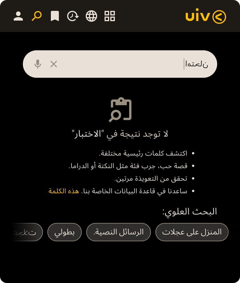
Set up LTR and RTL language guideline
Embrace the principles of universal design. Before creating new layouts, I conduct regional assessments, considering Left-to-Right (LTR) and Right-to-Left (RTL) language configurations, to guarantee an inclusive user experience.
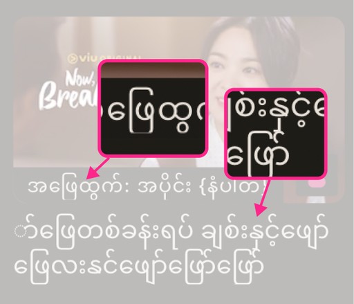
Language Handling: Thai, Arabic and Myanmar (Burmese)
Consider variations in text length, line-height, and readability for diverse languages to guarantee a universally inclusive design for global users.
Consider variations in text length, line-height, and readability for diverse languages to guarantee a universally inclusive design for global users.
Avoid using sans-serif typefaces on Thai sites as not every single Thai user can read sans-serif typefaces. For Myanmar(Burmese) language, we have to consider the horizontal space to display as it usually comes with wider and longer word lengths.
🪜
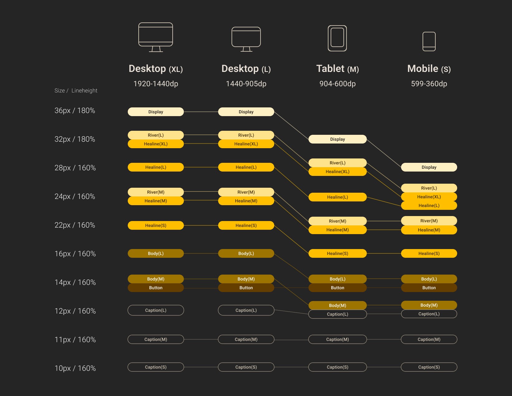
Type Scale
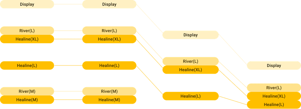
I created a type scale to apply responsive font size by content. It helps organize a more consistent design and is more efficient to apply font sizes
🔩
Specification
Translation Gap: UI & Dev
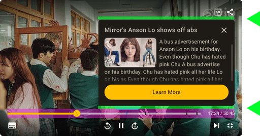
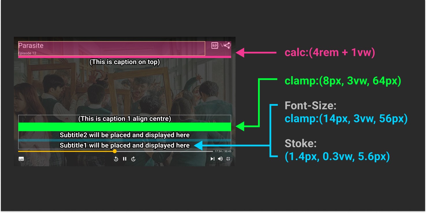
Video-player subtitles are showing inconsistent sizes on various tablet devices, becasue font size is responsive by merely 4 breakpoints.
Fluid + Responsive + CSS
To address the issue in video-player, I used {font-size: clamp:(14px, 3vw, 54px)} or {clac:(4rem + 1vw)} to make sure all subtitle can size seamlessly on various screens.
⚙️
Tech-feasible Design
Library-based
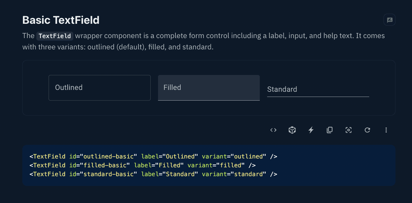
As development team is using Material UI (MUI) to implement the layout. I will usually check up MUI library to ensure that my designs are not only visually appealing but also technically feasible, making them easier to bring to life and maintain over time.
🧩
Customizable Component
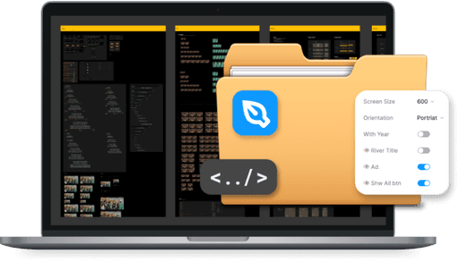
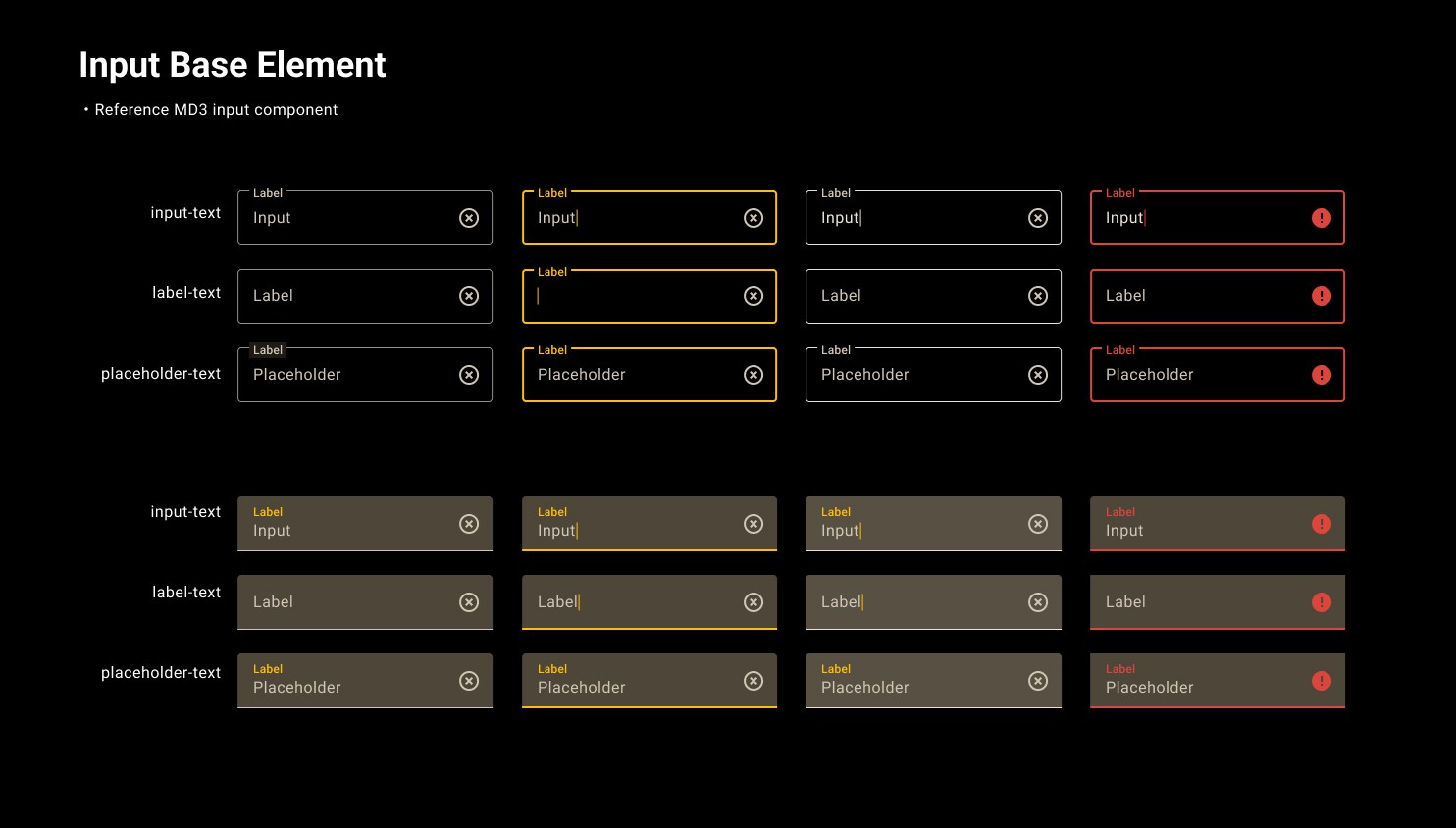
I utilize Figma's customizable components for an efficient and consistent design. Reusable elements can be created and changes applied easily, allowing for flexibility while maintaining consistency.
🔗
How to Sync with Team?
Change Log
Mark down what has been changed in the Design System whenever designers make amendments. Create a monthly change log on the design system file.
Construction Site Area
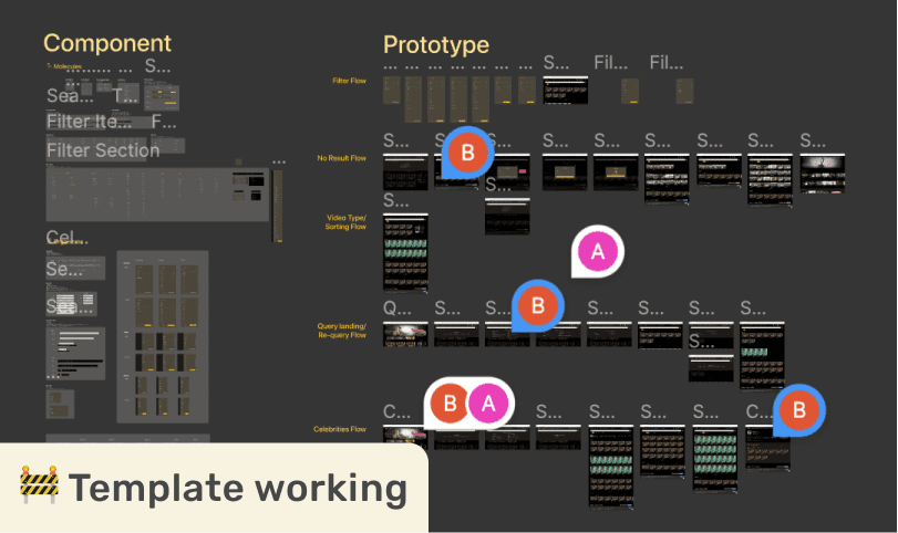
A separate page named "🚧 Construction Site", All new created components and layouts will be placed here. After layouts are approved, we put the updated design into DS.
Changes on existing component?
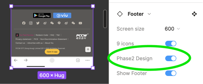
An updated component with a new style will be made inside the instance property and tagged and create a new variant named "New Design".
Graveyard
In case we need to trace back the old design, I create Graveyard section and put the fade-out component here, so we could find the legacy item for reference.
🥾
Improvement
Sectors
Before
After
Foundation
100% synced 25 colours
14 font sizes
Spacing scale
Type Scale
Font responsiveness
Operational
—
—
—
PRD
Change Log
Front-end snippet
Components
Responsive only
Web-only icons
—
—
9 organisms panels
Responsive + Fluid Design
Cross-platform icon
3rd Party Components
Prompt standard
18 organisms panels
Globalization
Trimmed local text
—
Line-height standard
AR, TH, MM Typeface
